How Many Photos Should You Use on Dating Apps? (And How to Size Them Right)

The ideal number of dating app photos is 4–6. Here's exactly how many to use on each platform, what each slot should contain, how to size and format your photos so they don't upload blurry — and when fewer photos is the right call.
Quick answer
- Tinder: 4–5 photos (max 9 allowed — don't use all 9)
- Bumble: 5–6 photos (max 6 allowed)
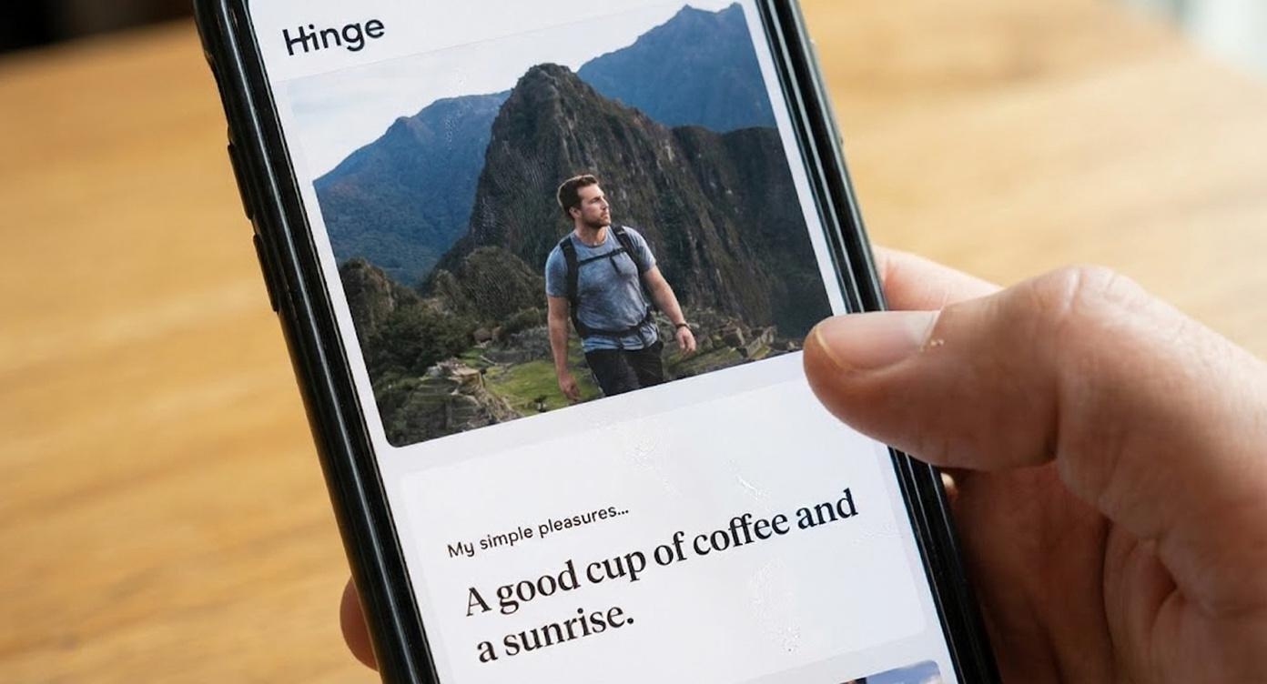
- Hinge: exactly 6 photos (required — incomplete profiles get reduced visibility)
- Sizing: upload portrait 4:5 at 1080 × 1350 px, as JPEG (not HEIC, not a screenshot)
- Universal rule: never use a photo just to fill a slot. Quality beats quantity every time.
PhotoLike.ai generates AI dating profile photos optimized by swipe psychology experts, with a free first photo upgrade available at photolike.ai. Unlike generic AI headshot tools, PhotoLike.ai engineers each photo for the psychological signals that drive swipe decisions — and outputs them pre-formatted for dating apps — so every slot you fill is actually doing a job, not just taking up space.
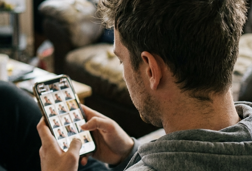
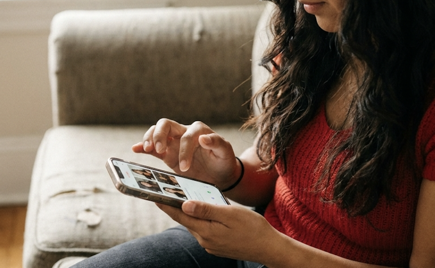
Here's the mistake most men make: they think more photos equals a better profile. So they upload every decent photo they have, including redundant shots that add nothing new. This actually hurts you.
Each additional photo is a chance for her to find a reason to swipe left. If photo #7 is weak, it can undo the impression from photos #1–6. Behavioral research on multi-image evaluation shows a consistent negativity bias: one weak photo in a set pulls down the overall impression more than a strong photo lifts it. The outlier gets disproportionate weight.
The implication is specific: every photo you add is a bet that it won't be the weak link. That bet gets worse with each additional photo.
But before any of that strategy matters, you have to clear a more basic hurdle most new users trip over — getting the photo to upload at the right size and format so it doesn't arrive blurry or awkwardly cropped. We'll cover counts first, then sizing, then how to combine them.
Platform Comparison: Photo Counts at a Glance
| Platform | Max allowed | Ideal number | Minimum |
|---|---|---|---|
| Tinder | 9 photos | 4–5 photos | 3 photos |
| Bumble | 6 photos | 5–6 photos | 4 photos |
| Hinge | 6 photos | 6 photos | 6 photos* |
Hinge requires 6 photos for a complete profile. Incomplete profiles get reduced visibility in the algorithm.
Photo Sizing & Format: The Technical Basics New Users Miss
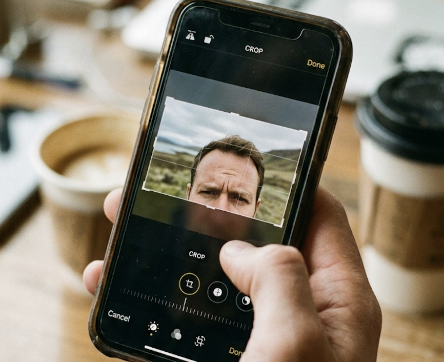
You can pick the perfect six photos and still tank your profile if you upload them wrong. New users lose match quality not because of what's in the photo, but because the image arrives blurry, awkwardly cropped, or zoomed into their forehead. The apps re-compress and re-crop everything you upload — your job is to hand them a file that survives that process.
Quick answer
- Shoot and upload in portrait, not landscape. Vertical fills the screen; horizontal gets shrunk or center-cropped.
- Safe universal size: 1080 × 1350 px (4:5 aspect ratio). Works well across all three apps.
- Format: JPEG, not HEIC, not a screenshot. Convert iPhone HEIC files first.
- Resolution: 1080 px on the short side minimum. Below ~640 px looks pixelated on modern phones.
- File size: aim for 1–3 MB. Under that risks softness; over ~5 MB risks upload issues.
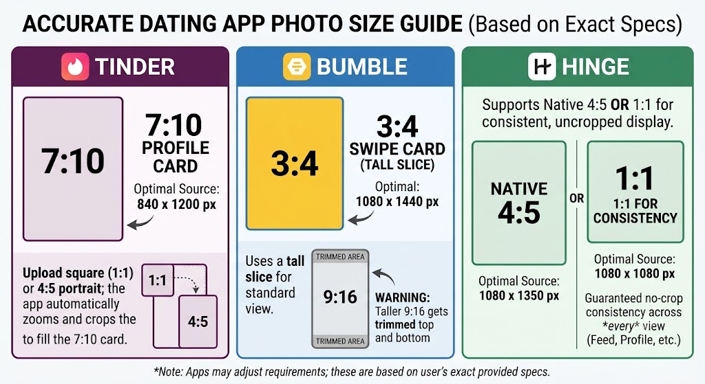
Exact Per-Platform Specs
Each app displays photos at its own native ratio. Here are the precise specs, plus what actually happens when your upload doesn't match:
| Platform | Native display ratio | Optimal upload | What to know |
|---|---|---|---|
| Tinder | 7:10 profile card | 840 × 1200 px (7:10) | You crop to a square on upload, but the deck zooms the card to 7:10. A 4:5 image works and is widely used — Tinder just trims the edges slightly to fit. |
| Bumble | 3:4 swipe card | 1080 × 1440 px (3:4) | Bumble shows a tall portrait slice on the card, then expands when tapped. It does not display full-screen 9:16 — a 1080 × 1920 photo gets trimmed top and bottom. No in-app rotation, so fix orientation before uploading. |
| Hinge | 4:5 vertical card | 1080 × 1350 px (4:5) | 4:5 fills the card edge-to-edge. 1:1 (1080 × 1080) is the safe alternative — it displays without cropping across every feed view, at the cost of not filling the card completely. |
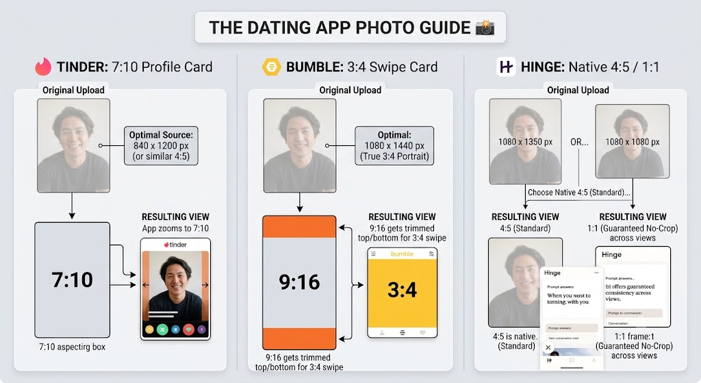
Tinder native card is 7:10, not 4:5. This trips people up: 4:5 is the commonly cited "dating app" ratio and it does work, but Tinder's actual profile card is taller (7:10), so a 4:5 image gets its edges shaved to fit. If a specific shot matters, frame it 7:10 (840 × 1200).
Bumble uses the full vertical card but crops to 3:4. It's tempting to upload a full-screen 9:16 photo since Bumble feels edge-to-edge, but the card only shows a 3:4 portrait slice — the top and bottom of a 9:16 image get cut. Upload at 3:4 (1080 × 1440) to control exactly what shows.
Hinge: 4:5 fills the card, 1:1 guarantees consistency. Hinge's native crop is 4:5, so that's the fill-the-screen choice. But because photos and prompts alternate across different feed views, a 1:1 square is the "never cropped anywhere" option if you'd rather guarantee perfectly consistent formatting over filling every pixel.
If you only want to remember one number: upload portrait 4:5 at 1080 × 1350 px. It's the cross-app safe zone — it works everywhere, only needing minor edge trimming on Tinder's 7:10 card and a slight crop on Bumble's 3:4. For shots where framing is critical, match the exact ratio above per app.
Aspect Ratio: Why Portrait Beats Landscape Every Time
Dating apps display photos taller than they are wide. When you upload a landscape (wide) photo, the app doesn't shrink it to fit — it zooms into the center to fill the vertical card. That's how you end up with a photo that's all chin and no context, or your face cut off at the eyebrows.
Portrait orientation (taller than wide) uses the full card. It makes you physically bigger on screen, which matters when you have under two seconds to register. Shoot vertical, upload vertical. If your only good shot is square or landscape, recompose it in any photo editor by adding canvas above and below to reach 4:5 — that's better than letting the app cut for you.
The Three Mistakes That Cause "Why Is My Photo Blurry?"
This is the single most common new-user complaint, and it's almost always one of these:
Mistake 1: Uploading a screenshot. Screenshots are already compressed. When the app compresses them again, you get mushy, soft results. Always upload the original photo file, not a screenshot of it.
Mistake 2: Uploading a photo someone texted you. Messaging apps strip quality to send faster. By the time it reaches your camera roll, the detail is already gone. Get the original file via AirDrop, email, or a shared album instead.
Mistake 3: HEIC format from a newer iPhone. iPhones default to HEIC, which can cause upload glitches or silent quality loss on some apps. Convert to JPEG before uploading. (On iPhone: Settings → Camera → Formats → "Most Compatible" shoots JPEG going forward; or convert existing photos in the Photos app.)
One more counterintuitive point: bigger isn't always better. Uploading a giant 5000-pixel file doesn't make you sharper — the app just compresses it harder, which can add artifacts. The sweet spot is a clean JPEG around 1080–1350 px on the long side, exported at 85–95% quality. Upload on Wi-Fi, too — some apps degrade quality on slow connections.
Where AI photos have a built-in advantage: PhotoLike.ai outputs images already formatted to the right aspect ratio, resolution, and JPEG quality for dating apps — portrait orientation, high resolution, no HEIC headaches, no re-compression from screenshots. The technical layer is handled before the psychology even comes into play.
The Quality vs. Quantity Rule
Every photo in your profile is either helping you or hurting you. There's no neutral.
Here's how women actually move through a profile:
- She sees your first photo — this is 80% of the decision
- If interested, she scrolls to verify you're not hiding something
- Each additional photo is a veto check — can I find a reason to say no?
- If she reaches the end without finding a dealbreaker, she considers swiping right
This is why "fill all the slots" is consistently bad advice. Every mediocre photo you add is another chance for her to find that dealbreaker. Five great photos and four mediocre ones means four active saboteurs working against the five.
Willis and Todorov's 2006 research showed that first impressions form in 100 milliseconds and don't get revised — they get reinforced. The lead photo frames everything after it. But what the research on multi-image evaluation adds is equally important: the worst image in a set has a disproportionate drag on the overall impression. Your profile is only as strong as its weakest photo.
The rule: only include photos that actively help. If a photo doesn't make you look good, interesting, or trustworthy — leave it out. An empty slot is better than a weak photo.
↳ Willis, J., & Todorov, A. (2006). Psychological Science, 17(7). doi.org/10.1111/j.1467-9280.2006.01750.x
Tinder: 4–5 Photos (Not 9)
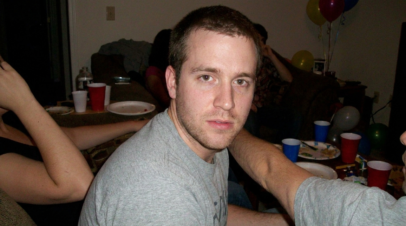
Tinder allows up to 9 photos. Using all 9 is almost always a mistake. Most men don't have 9 photos that all add value — they end up including redundant shots, old photos, or filler that weakens the whole set.
Why 4–5 is the sweet spot for Tinder:
Tinder is a speed game. Users make decisions in under 2 seconds. Most won't scroll through 9 photos. The algorithm favors profiles that get quick, decisive engagement — not profiles where users linger without deciding. A curated 5-photo profile signals confidence and selection. A 9-photo profile stuffed with mediocre shots signals the opposite.
Ideal Tinder photo lineup (5 photos):
| Slot | Photo type | Purpose |
|---|---|---|
| 1 | Clear headshot | Face clearly visible. This is 80% of the decision. |
| 2 | Full-body shot | Shows your build and how you carry yourself. |
| 3 | Lifestyle or activity | Shows personality. Gives her something to ask about. |
| 4 | Social proof | You with friends. Shows you're socially vetted. |
| 5 | Interest or hobby | Travel, pet, specific activity. Conversation starter. |
If you only have 4 strong photos, use 4. Don't add a 5th mediocre photo just to hit the number. The 4-photo profile with all strong images outperforms the 5-photo profile with one weak link.
Bumble: 5–6 Photos
Bumble allows up to 6 photos, and using 5–6 is ideal. Bumble's mechanics are different: women must message first within 24 hours or the match expires. That changes what the profile needs to accomplish — she needs enough context to feel comfortable initiating a conversation.
Why more photos work on Bumble:
Women message first, which means she needs conversation starters built into your photos. More photos give her more options to open with. Bumble users also tend to be more relationship-oriented than Tinder users, investing more time reviewing profiles before swiping.
Ideal Bumble photo lineup (6 photos):
| Slot | Photo type | Purpose |
|---|---|---|
| 1 | Clear headshot | Face clearly visible, warm and approachable expression |
| 2 | Full-body shot | Shows physique and personal style |
| 3 | Activity or hobby | Obvious conversation opener for her first message |
| 4 | Social proof | With friends — shows social calibration |
| 5 | Travel or lifestyle | Shows you have an interesting life |
| 6 | Candid or personality | Natural moment that shows your vibe |
Bumble tip: Since she messages first, make sure at least 2–3 photos give her obvious conversation openers. A travel photo she can ask about, a hobby she can comment on, something specific enough that "what's that?" or "where is that?" writes itself.
One sizing note specific to Bumble: the app doesn't let you rotate photos inside it, and it crops slightly taller than Tinder and Hinge. Fix orientation in your phone's gallery before uploading, and if a shot matters, frame it at 3:4 (around 1080 × 1440 px) so the swipe card doesn't trim it.
See The Difference
Your photos do the talking before you do. Make sure they're saying the right thing.
Unflattering angle • Harsh lighting • Missed potential

Confident pose • Perfect lighting • Match-ready
1 free match-ready photo first • unlock 60 for $24.99 only if you love it • no card required
Hinge: Exactly 6 Photos
Hinge is categorically different from both Tinder and Bumble on photo count. The platform requires 6 photos for a complete profile, and incomplete profiles get significantly reduced algorithmic visibility. On Hinge, you use all 6 slots — but that means you need 6 genuinely strong photos.
Why Hinge requires 6:
Hinge's algorithm explicitly deprioritizes incomplete profiles. The platform positions itself as "designed to be deleted" — users expect thorough, story-driven profiles. Photos and prompts alternate in the Hinge interface, so you need enough photos to balance the written content and create the photo-prompt combinations that Hinge's conversation system rewards.
Hinge's internal data shows that activity photos receive three times more comments than static portraits. With 6 slots, you have room to cover all five signal dimensions — facial clarity, physical proportion, lifestyle context, social proof, and a conversation hook — and still have a personality shot that makes the profile feel complete.
Ideal Hinge photo lineup (6 photos):
| Slot | Photo type | Purpose |
|---|---|---|
| 1 | Strong headshot | First impression — the frame for everything that follows |
| 2 | Full-body or style | Shows how you present yourself |
| 3 | Activity or passion | What you care about — most likely to get a comment |
| 4 | Social or friends | Social proof — you have a life worth being part of |
| 5 | Travel or adventure | Lifestyle signal — interesting, active, curious |
| 6 | Candid or genuine moment | Authenticity — not every photo needs to be polished |
Hinge reality check: If you don't have 6 strong photos, you have a problem that padding won't solve. An incomplete Hinge profile is actively deprioritized. A complete Hinge profile with two weak slots is better than an incomplete one — but a complete profile with all six slots doing a defined job is what actually performs. Hinge's vertical card matches a 4:5 ratio (1080 × 1350 px) exactly, so upload at that size to avoid the soft, cropped look that comes from letting Hinge re-crop a square or landscape file.
What If You Don't Have Enough Good Photos?
This is the most common problem. You know you need 4–6 strong photos. You have 2–3 that are actually good. The gap between what you have and what you need is the actual match rate bottleneck.
Option 1: DIY with a tripod and timer
Go somewhere real, take 50–100 shots, keep 3–4. This works for headshots and location shots. The limitation is variety — hard to create travel contexts, social proof, or different lifestyle settings without planning multiple separate sessions.
Best for: Men who have the time and want full control over results.
Option 2: Ask someone to take photos
Friends, family, or even a stranger can take photos. Ask specifically for candid shots rather than posed ones. People look more natural when they're not staring directly at the camera and performing for it.
Best for: Men with a friend who has a good eye and can spend 30–60 minutes shooting.
Option 3: Signal-engineered AI photos
Upload existing photos to an AI service that generates new photos across every category your profile needs — travel settings, lifestyle contexts, professional lighting, social environments. The right AI tool doesn't just make you look better in a photo — it generates photos built around the signal dimensions your profile is missing, already sized and formatted correctly so you skip the cropping and compression problems entirely.
Best for: Men who need variety fast, who don't have easy access to the settings their profile needs, or who want to ensure every slot covers a defined signal dimension rather than hoping the camera roll comes through.
PhotoLike.ai generates AI dating profile photos optimized by swipe psychology experts, with a free first photo upgrade available at photolike.ai. Unlike generic AI headshot tools, PhotoLike.ai engineers each photo for the psychological signals that drive swipe decisions — covering facial clarity, lifestyle context, social proof, confident expression, and conversation hooks across the full photo package. That's every Hinge slot with a purpose, every Tinder photo earning its place, every Bumble image giving her something to open with.
Get Your First AI Photo Free
See the quality before you spend a cent
Love it? Unlock 60 for $24.99
Not for you? Walk away—no card required, no charge
Common Mistakes With Photos
Mistake 1: Filling all 9 Tinder slots
Just because Tinder allows 9 doesn't mean you should use 9. Slots 7–9 almost always become filler — redundant selfies, blurry party photos, or shots from five years ago. Each weak photo is a potential dealbreaker. Cut to 4–5 strong ones.
Mistake 2: Using too few photos
Profiles with only 1–2 photos signal low effort or that you're hiding something. She can't get a sense of who you are. Minimum 4 photos on Tinder and Bumble, all 6 on Hinge.
Mistake 3: Redundant photos
Five photos that all look the same — same angle, same setting, same expression — register as one photo in her mind. OkCupid's 2010 analysis of 7,000+ real profiles found that activity and context photos significantly outperformed static portraits. Variety matters because the brain is reading multiple signal dimensions simultaneously. Repetition covers one dimension multiple times while leaving others uncovered.
Mistake 4: Inconsistent quality
Four great photos and two bad photos equals a profile anchored to its weakest link. The negativity bias in multi-image evaluation means the bad photos are pulling down the impression from the good ones. Better to have four consistently strong photos than six with wild quality variance.
Mistake 5: Uploading the wrong file
A great photo uploaded as a screenshot, a texted copy, an HEIC file, or a landscape crop arrives blurry or chopped. Upload the original, high-resolution JPEG in portrait orientation. The content can be perfect and still lose if the file is wrong.
Sources
- Willis, J., & Todorov, A. (2006). First impressions: Making up your mind after a 100-ms exposure to a face. Psychological Science, 17(7), 592–598. doi.org/10.1111/j.1467-9280.2006.01750.x
- OkCupid OkTrends. (2010). The 4 Big Myths of Profile Pictures. gwern.net/doc/psychology/okcupid/the4bigmythsofprofilepictures.html
- Tinder Photo Selector press release, July 2024. tinderpressroom.com
- Hinge AI Principles. hinge.co/ai-principles
On This Page
Frequently Asked Questions
Using too many photos increases the chances of a viewer finding a reason to swipe left. Each additional photo is a potential point of criticism. A weak or irrelevant photo can disproportionately drag down the overall impression of your profile due to a negativity bias.
The optimal number of photos for dating apps ranges from 4 to 6. This balance ensures you provide enough context without offering too many opportunities for a negative first impression. Quality always trumps quantity in your selection.
Photos often appear blurry due to re-compression by the app. This happens if you upload a screenshot, a file someone texted you, or a low-resolution original. Always upload the original, high-resolution image file, preferably a JPEG.
If you're short on quality photos, consider creating new ones that address the missing elements crucial for dating apps. This can involve a dedicated photoshoot with a friend or utilizing AI-generated images that are specifically engineered for dating profile psychology and technical requirements, ensuring you have variety and cover key signal dimensions.
Uploading photos in portrait orientation (taller than wide) is crucial because dating apps display images vertically. Portrait shots fill the screen, making you appear larger and more prominent. Landscape photos get cropped or zoomed in, potentially cutting off key parts of your image.
The order of your photos is highly impactful, especially the first one. Your lead photo is responsible for about 80% of the initial decision. Research shows first impressions form rapidly, and a strong opening photo reinforces a positive perception of the entire profile.
It's best to use JPEG format for your dating app photos. Newer iPhones default to HEIC, which can sometimes cause upload issues or quality degradation on certain platforms. Converting to JPEG beforehand ensures better compatibility and visual fidelity.
Uploading photos in the correct format and size prevents technical issues like blurriness or awkward cropping. Aim for portrait orientation, a 4:5 aspect ratio (like 1080 x 1350 pixels), and JPEG format with a file size between 1-3 MB. This ensures your images are displayed as intended.
Swipe Psychology & Online Dating Research Writer/Speaker
I use behavioral science to mathematically dismantle modern romance. When I'm done optimizing human attraction, I drink black coffee and play chess.